Setelah belasan tahun merekrut desainer, meninjau ratusan CV serta design portfolio untuk tim Product Design, salah satu masalah klasik yang saya temui adalah kurangnya kesadaran para kandidat bahwa UX Design, UI Design, dan turunannya adalah bagian dari payung besar User-Centered Design (UCD).
Pemahaman ini penting, karena walaupun sekilas mirip, UCD berbeda dari Visual Communication Design (Graphic Design) dalam hal tujuan, prioritas, dan cara kerja:
User-Centered Design (UX/UI): Fokus pada memecahkan masalah pengguna dan memfasilitasi tercapainya tujuan di dalam produk digital, berhubungan erat dengan fungsi dan perilaku pengguna
Graphic Design (Komunikasi Visual): Fokus pada menyampaikan pesan dan membangkitkan perasaan, lebih menekankan pada estetika dan persepsi
Keduanya memang saling tumpang tindih, tetapi biasanya melibatkan proses yang sangat berbeda. UCD menuntut keterlibatan aktif pengguna, misalnya melalui user research, prototype testing, dan validasi, sementara Graphic Design lebih banyak mengandalkan benchmarking, eksplorasi kreatif, dan pemolesan visual.
Lalu, bagaimana keduanya berkontribusi pada kesuksesan suatu produk digital? Graphic Design bantu mendorong konversi, contohnya melalui landing page yang menarik, dan user interface yang estetik. Sedangkan UCD memastikan produk lebih mudah diadopsi dan menciptakan stickiness. Dua aspek ini sama-sama penting untuk keberlangsungan dan pertumbuhan bisnis digital.
Bagaimana cara seorang Graphic Designer sukses bertransformasi menjadi UX/UI Designer?
Berdasarkan pengalaman dalam membangun dan mengelola Design team di aneka perusahaan, baik dari nol maupun mengembangkan talents yang sudah ada, ada dua cara yang terbukti ampuh. Tentunya butuh pembelajaran dan adaptasi, namun dengan sistem terstruktur dan mentoring, rata-rata berhasil menunjukkan perkembangan baik dalam rentang waktu 3-6 bulan.
Pertama, dengan mengadopsi metodologi User Centered Design semisal Six Steps Design Thinking nya Stanford Institute of Design (D.School), atau lainnya sejenis. Hal ini berguna untuk memperkaya proses kreatif seorang desainer dengan metode dan tools yang membantu pemahaman terhadap kebutuhan users dan cara memfasilitasinya.
Selanjutnya yang tak kalah penting, adalah perubahan mindset dari mysterious magician menjadi thought partners, yaitu dengan mengimbangi proses kreatifnya dari tadinya hanya inside-out, sangat didominasi pemikiran internal, ekspresi personal, dan perkembangan yang tersilo, terpisah dari team lainnya — dengan menambahkan proses outside-in, yaitu secara aktif mencari validasi dari users, serta stakeholders lainnya yang terlibat.
Salah satu ciri khas individu neurodivergen dibandingkan dengan individu neurotipikal adalah Disfungsi Regulasi Dopamin: sebuah kondisi biologis berupa ketidakseimbangan dalam proses produksi, penggunaan, dan penyerapan kembali (reuptake) dopamin di otak.
Kondisi ini sering kali termanifestasi dalam kesulitan individu neurodivergen pada tugas-tugas yang bergantung pada dopamin, seperti memotivasi diri, mempertahankan perhatian (sustained attention), mengendalikan impulsivitas, dan fungsi eksekutif otak–yang mencakup manajemen diri, regulasi pikiran dan tindakan, serta regulasi emosi. Akibatnya, banyak individu neurodivergen dipersepsikan sebagai moody (mudah berubah suasana hati) dan pemalas oleh individu neurotipikal.
Bagi mereka yang terlambat terdiagnosis, hal ini seringkali menyebabkan tumbuhnya perasaan bersalah dan keraguan diri yang mendalam. Ini merupakan dampak dari tekanan berulang kali dari lingkungan yang menyatakan bahwa mereka pemalas, tidak cukup berusaha, kurang tekun, dan berbagai ‘kekurangan’ lainnya — khususnya jika dibandingkan dengan rekan-rekan mereka yang neurotipikal.
Mengingat berbagai permasalahan yang dialami individu neurodivergen ini berakar pada kondisi biologis, pendekatan penanganannya pun memerlukan upaya-upaya proaktif untuk mengelola siklus dopamin — tidak cukup hanya mengandalkan motivasi, apalagi sekadar memberi label yang keliru dan mengalienasi.
Lalu, upaya seperti apa yang dimaksud?
Penelitian JAMA Psychiatry (2023) menyatakan bahwa terapi multimodal (obat + perilaku + gaya hidup) memberi hasil optimal.
Mekanisme Kunci yang Dimanfaatkan:
1. Meningkatkan Sintesis Dopamin (Diet tirosin, olahraga).
2. Memperpanjang Durasi Kerja Dopamin (Obat penghambat reuptake).
3. Menciptakan Dopamine Peaks Buatan (Pemecahan tugas, gamification).
4. Mengurangi Dopamine Depletion (Manajemen energi, tidur berkualitas).
Di samping tantangan yang dihadapi, individu neurodivergen sebenarnya memiliki sejumlah keunggulan bawaan yang unik: kemampuan hiperfokus pada tugas yang dirasakan menarik, kecenderungan kreativitas, kemampuan alami untuk berpikir ‘di luar kotak’ (outside-the-box thinking), kepekaan dalam mengenali pola (pattern recognition) dan menghubungkan berbagai hal — bahkan yang tampak tidak terkait — serta antusiasme tinggi terhadap ide-ide baru dan inovatif.
Salah satu figur historis yang sering diduga sebagai contoh klasik individu neurodivergen adalah Leonardo da Vinci. Meskipun tidak ada diagnosis klinis yang dapat diverifikasi semasa hidup sang maestro seni dan sains tersebut, banyak catatan mengenai tanda-tanda yang ditampilkannya sangat konsisten dengan pemahaman modern tentang neurodivergensi.
Regulasi dopamin yang efektif bagi neurodivergen adalah fondasi untuk mewujudkan potensi unik mereka. Empat pilar mekanisme kunci: sintesis, durasi, puncak buatan, dan pengurangan deplesi, bukanlah daftar perbaikan, melainkan peta navigasi. Menerapkannya memerlukan kolaborasi: klinisi meresepkan intervensi berbasis bukti, komunitas menyediakan akomodasi bebas stigma, dan individu mengeksplorasi strategi yang selaras dengan neurologinya. Seperti hiperfokus Da Vinci yang mengubah sejarah, mengelola siklus dopamin adalah kunci membuka pola pikir divergen yang mampu merevolusi cara kita memecahkan masalah kompleks.
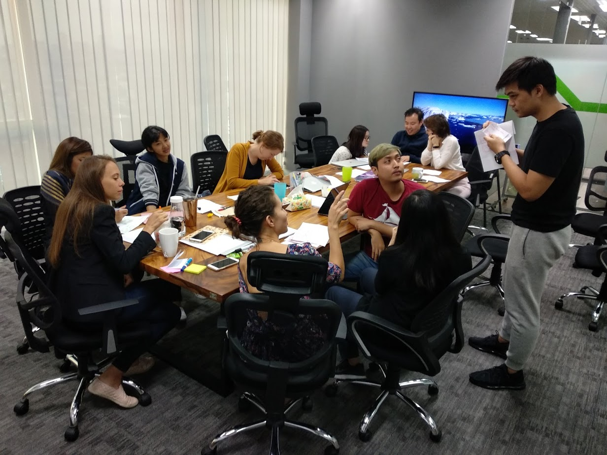
You’ve poured weeks into a design: research, iterations, late nights. Then, in the boardroom, stakeholders tear it apart. Welcome to the Boardroom Massacre: where brilliant work dies because stakeholders expected something else. The root cause? They weren’t part of the journey. Here’s how to fix it.
Throughout different teams I’ve helped develop, one major issue stands out as the most painful challenge in a design team without senior design leadership: the disconnect between designers and the stakeholders, which often emerges as stakeholders frustration and distrust of the designers.
The real culprit? Stakeholders aren’t invested in the solution. Designers often work in isolation, presenting ‘finished’ work that shocks stakeholders who expected something entirely different.
Mostly there are two reasons, first, incapable designers; second, lack of design ownership from the stakeholders. While training (or hiring) can fix unskilled designers, the second issue demands approaches that feel unnatural to many designers.
Traditionally, designers are expected to be magicians, pulling out amazing designs out of thin air, and lots of designers are also acting this way. It is a common thing for designers to incubate ideas on their own and only after some while comes out with the finished design that wowed its audience — or not, more often not.
While there are designers that can do magic, most will be struggling with understanding the incomplete brief, the vague stakeholders intention, and generating good enough ideas.
Therefore, forget the ‘big reveal.’ Instead, adopt iterative co-creation: share rough concepts early and often. This transforms stakeholders from critics to collaborators, building ownership before designs are polished.
That’s why, one of the actions I always advised my design mentees to master, is to build on their design through progressive disclosure: a quick, small iterations of build and learn.
The challenge is that lots of stakeholders might not see the benefits at first, and would think twice before agreeing to spend their precious time reviewing small design progress, however, designers need to ensure these regular checkups to ensure proper alignment.
As the consequence, stakeholders must also learn to get familiarized with the tools of user experience design to ensure proper communication takes place. Conventionally it means reading visual artifacts like wireframe or storyboard, which might add some challenges for less-design exposed stakeholders.
GenAI slashes prototype time, letting stakeholders experience ideas — not just imagine them. Clickable demos replace abstract wireframes, making feedback concrete and actionable.
Stop the massacre. Start iterating, include stakeholders early, and let GenAI handle the prototypes. Your next boardroom meeting? It might just be a victory lap.
Menyikapi menjamurnya aplikasi standalone milik pemerintah, serta keharusan masyarakat untuk menggunakan beragam aplikasi untuk tujuan berbeda-beda, dipadu dengan kurang efektifnya upaya sosialisasi, serta rumitnya koordinasi antar institusi negara di Indonesia, maka low hanging fruit yang masyarakat butuhkan adalah suatu hub pintar (“Smart Assistant”) yang bisa berkomunikasi dengan ratusan apps yang dibuat pemerintah, untuk bantu mencari informasi.
Dengan cara ini, user bisa mengakses informasi dari seluruh aplikasi milik pemerintah. Idealnya sampai melakukan proses interaksi yang dibutuhkan, tanpa harus menginstall aplikasi-aplikasi tersebut terlebih dahulu, atau minimal supaya mendapatkan kejelasan aplikasi apa yang harus ia install.
Persyaratan yang penting untuk segera diterapkan untuk mendukung model hub-and-spoke ini ini adalah mewajibkan semua app yang dibiayai APBN/APBD untuk membuka API untuk koneksi data. Rumah untuk model ini (hub) bisa dibuat di aplikasi eKTP, atau non-govt made.
Model ini tidak ideal, tapi ini cukup fleksibel untuk memfasilitasi strategi transisi ke depannya, mengingat belum terlihat adanya upaya untuk melakukan koordinasi agenda antar instansi, dan pembuatan aplikasi digital masih dianggap sebagai suatu prestasi kerja. (byms)
Indonesia is among the countries where its general population skipped desktop computers upon the digital evolution, and jumped straight into smart mobile phones. It challenges tech startups due to the different behavior and ability of this user segment.
For example, from User Research we discovered that among the biggest friction for buyers to close a transaction in OLX was in comparing products from different sellers, which is easy to do on desktop computers due to the ability to open multiple tabs, but it’s inherently difficult to do on a native mobile app due to limited screen estate.
While extreme users tend to have their own hacky ways to compare products, or simply switched to using a desktop, for the new users it’s a rather painful experience of going back and forth through different products or having to jot down notes on paper.
Our idea for a solution comes from another user research insight that even though most products in OLX are one of a kind (single-item inventory), buyers often manually take notes of interesting products they might want to buy later. It’s among the most surprising findings as in our initial hypothesis believed that since OLX is not an online shop with replenished stocks, users don’t need a product-saving feature.
Thinking to accommodate both the need to save a product listing, and compare several products to make decision, we’re introducing the ability to save favorites, and develop a page to do side-by-side comparisons of similar products.
We ended up including “Favorit” (Favorites, en.) as one of the menu items on the bottom menu bar, and reorganize the less important functions into sidebar or Settings. After launch, from analytics we discovered that Favorites has becoming one of the most used features in the All-New OLX version, and contribute a significant return traffic to products bookmarked. (byms)
The All-New OLX has bottom bar with “Favorit” menu.
Among the most interesting findings of User Research activities to improve Seller Onboarding flow in OLX was that most sellers have no idea about the proper price for their stuff to sell. This is due because OLX is a Customer to Customer (C2C) second-hand classified platform, where most of the sellers are common people, and for many, it’s also their first time selling their preloved, personal item online.
The current pattern we identified was for these casual sellers to first do research, either online or by asking their friends, to understand better the common price range. Some managed to get a good price for their stuff, while some find it hard to sell their stuff as it turned out they were asking for a price above the market rate.
The latter segment tends to have a bad experience selling in OLX which ends up leaving the platform for good, contributing to the churn rate. Fortunately, OLX’s Big Data already records thousands if not millions of successful transactions in the past, and this is something we can tap into.
I was thinking of shortening the research activity for our common sellers or even removing it completely, by creating a price recommendation feature where OLX would be able to suggest the ideal selling price, based on past recorded transactions.
The feature ends up as a price range suggestion, highlighting the tradeoff between faster speed of sale but lower profit, and higher profit but slower sale speed.
As this was a new feature, and a non-interactive one, we don’t have the baseline of measurement nor a proper way to measure its performance, however, from the follow-up research we discovered that it’s becoming one of the features that users would like to keep.
As an additional note, the common seller’s churn rate was also decreased, however, there were a couple of other improvement initiatives running in parallel hence we can’t really isolate the effect of this price recommendation feature.
Dalam interaksi di dunia online, kita sering sekali menemukan istilah “UI/UX” dipakai untuk mencerminkan aktivitas perancangan pengalaman pengguna.
Sering juga kita menemukan dalam komunikasi di dunia kerja cetusan semisal “UI masih nunggu UX” saat mengacu pada belum siapnya wireframe atau wireflow.
Padahal, jika mengacu kepada Don Norman, pionir gerakan User Experience Design, definisi UX adalah:
"User experience" encompasses all aspects of the end-user's interaction with the company, its services, and its products. ~ Don Norman, Nielsen Norman Group
Jika diterjemahkan,
"User Experience (pengalaman pengguna) mencakup semua aspek dari interaksi pengguna akhir dengan perusahaan, layanan-layanannya, dan produk-produknya."
Atau disederhanakan menjadi,
"User experience adalah keseluruhan aspek interaksi antara pelanggan dengan suatu perusahaan, layanan, dan produk nya."
Alhasil, UX bukanlah proses penciptaan wireframe, atau “tahapan sebelum UI”, tapi UX adalah keseluruhan proses desain itu sendiri, yang salahsatunya termasuk perancangan UI.
UX adalah “umbrella term” dari beragam aktivitas terkait penciptaan pengalaman pengguna yang menyenangkan.
Rata-rata ajang dan konferensi internasional pun mengusung judul “UX”, misalnya:
Lantas yang biasa dimaksud “UX” dalam konteks “UI/UX” itu apa?
Istilah yang dipakai di banyak perusahaan dan organisasi profesi adalah “Interaction Design (IxD)”, salahsatu disiplin di bawah payung istilah User Experience Design.
UX hanya mencakup desain?
Dalam praktiknya UX bahkan melibatkan juga divisi dan role lain di suatu perusahaan karena interaksi antara pelanggan dan suatu perusahaan terjadi sejak sebelum ia menggunakan aplikasi yang perusahaan buat.
Misalnya dengan team Marketing, saat menonton iklan TV yang menginformasikan produk dan layanan yang perusahaan tawarkan, lalu dengan team Sales, saat mempertimbangkan paket langganan mana yang akan dipilih. Atau, dengan team Customer Service saat harus meminta kejelasan terkait produk, layanan, dan lainnya.
Alhasil, untuk aktivitas UX design yang khusus terkait perancangan aplikasi saja, istilah yang lebih tepat adalah Digital Product Designer, atau “Product Designer” saja.
Ada berapa banyak jenis UI?
Secara definisi, UI (User Interface) adalah fasilitas interaksi antara pengguna dengan aplikasi. Walaupun istilah UI identik dengan tampilan visual, namun kenyataannya ada banyak ragam UI, misalnya Voice UI, Haptic UI, Gesture UI, tapi yang paling umum memang Graphical User Interface (GUI).
Jika diibaratkan restoran, maka UI adalah piring, sendok, garpu, pisau, dan gelas, yang kita gunakan untuk mengkonsumsi makanan dan minuman yang dijual restoran tersebut, sedangkan UX adalah gabungan dari pemilihan alat makan, desain interior, musik, dan layanan reservasi yang membantu terciptanya pengalaman makan yang berkesan.
Selain UI, ada banyak bagian lain dari UX, misalnya: Interaction Design, UX Writing, UX Illustration, Animasi, Sound effect, dan Information Architecture, yang akan kita bahas di artikel lain. (byms)
Istilah “Interaction Design (IXD)” bagi mereka yang merancang konsep desain produk digital seringkali disalahpahami sebagai perancang komponen visual interaktif, seperti dicakup oleh istilah “interactive multimedia” yang menurut Brittanica adalah:
“… any computer-delivered electronic system that allows the user to control, combine, and manipulate different types of media, such as text, sound, video…”,
… atau diterjemahkan menjadi,
“… sistem elektronik apapun yang bertenaga komputer dan mengijinkan pengguna untuk mengendalikan, mengkombinasikan, dan memanipulasi aneka jenis media, misalnya text, suara, video…”
Sistem elektronik yang dimaksud misalnya Personal Computer (PC), video games, kiosk, tablet, smart watch, dan lainnya.
Sementara kata “interaction” dalam “Interaction Design (IXD)”, sebagaimana studi “Human-Computer Interaction (HCI)” kalau mengacu ke Adobe adalah,
“… interaction between people and computers as well as the design of the computer interface…”
… atau diterjemahkan menjadi,
“… interaksi (hubungan saling mempengaruhi), antara manusia dan komputer, termasuk perancangan antarmuka komputer…”
Alhasil, beda dua huruf terakhir saja, “ive” dan “ion”, maksudnya akan sangat berbeda.
Adapun masyarakat Indonesia (termasuk banyak startup founders), secara sejarah lebih familiar dengan “interactive design” sebagai bagian dari multimedia design yang marak di akhir tahun ’90 an dalam bentuk interactive CD, dan dilanjutkan dengan kemunculan teknologi Flash, hingga kemundurannya saat Flash tidak lagi didukung oleh browsers.
Alhasil, kadang masih terjadi kesalahpahaman bahwa tugas seorang Interaction Designer (IXD) mencakup pembuatan micro interaction, atau animasi perubahan tampilan sebagai reaksi atas aksi pengguna (atau perubahan sistem), padahal ini kualifikasi yang lebih condong ke arah User Interface Designer (UID) atau Visual Designer. (byms)
The project was unique as it poses an interesting question: what product will become our future-proof solution? Think within the context of work productivity, collaboration, project management, activities that we already have a ground on, but think outside of the box.
As an example, look into MS Excel, surveys shows that it’s the No.1 Project Management tool in the world despite the success of Trello, Asana, and the likes. Why? Because people find it easy to use and good enough to cater to most of their project management needs.
Its “open-scenario” style also makes it a very versatile tool, therefore despite its branding as a spreadsheet solution, people use it for many things beyond a spreadsheet. Product Owners use it for Roadmap and Backlog, programmers use it as a database, some could even program their software using Macros in Excel!
What would be something that we can create to match Excel’s versatility?
To answer this question I look into the tools I’ve already use, to look for inspirations. What project management tools do I use? What are the other tools that I find very useful in my day to day work? Then I asked my colleagues the same questions to ensure minimum bias. After that research, the answer converged into three tools: Google Keep, Apple Note, and sticky notes!
Why sticky notes?
I love sticky notes! It’s a multi-purpose tool that you can use to taking notes, creating reminders, sending a message for others, insight generation in card-sorting activity, and many things. You can even create artwork from it! In fact, even in our office we quickly realized we used sticky notes a lot. It’s on the walls, the windows, monitors, tables, refrigerator, everywhere!
My concern with sticky notes is its very silo-ed and analog nature, meaning its content can not be seamlessly integrated into other media, rather permanent, space is very limited, and not easily duplicable. The available digital version back then, even from its originator 3M, was leaning towards creating a virtual board for you to play around with digital sticky notes, yet weirdly, copying their limitation as well. Among those that pushed for innovation, Miro was the one that proposes interesting value as a digital whiteboard, but it still doesn’t answer the needs we identified.
On the other hand, we have Keep/Note that is also used in a similar fashion: you can use it for almost everything! What’s good about those is that they’re digital, so it carries the awesomeness of digital products like the ability to edit, copy and paste, search contents, and adds multiple properties like adding date, sharing, color, links.
So I was wondering if we could somehow create something that represents these two marvels.
Turned out we could.
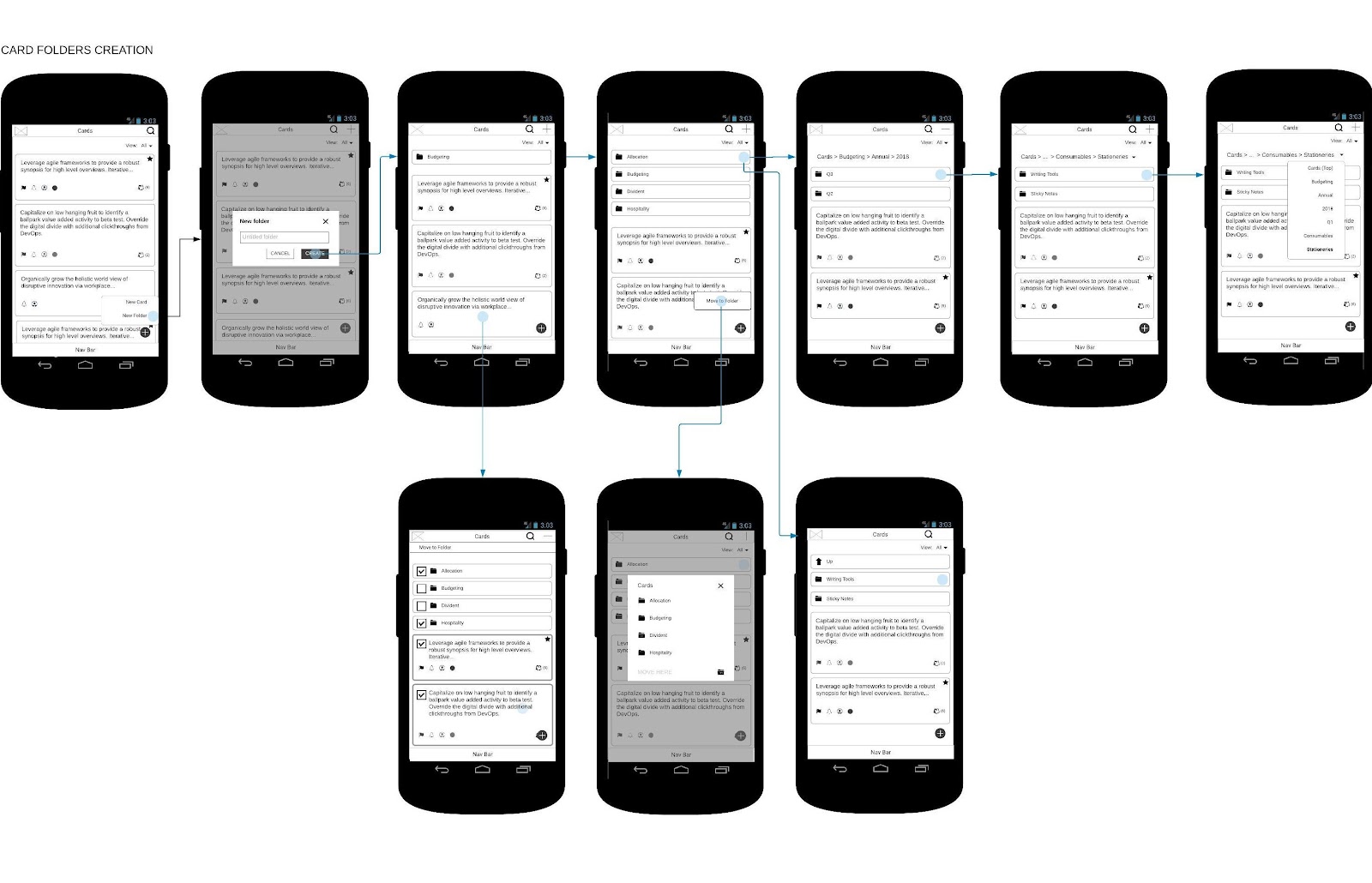
The Concept
The converged idea comes in one afternoon and I quickly sketched it on a piece of paper to show to the CEO/Head of Product, the CTO, and my Product Owner counterpart. After a quick discussion and add on notes, this is what we got:
The concept that we agreed upon is a “note”, an entity that can be made to support different purposes through properties, e.g. date, people, response, comment, and can be linked to other cards to form a cluster of cards. This way, you can even do project management using cards! Simple, versatile, powerful.
The next step is to decide on the look, and how it works. For these goals, our team did a lot of case studies collecting to identify common use-cases, a co-creation workshop to tap into our colleague’s rich knowledge, as well as doing benchmarking.
By running tests with our current users, and speaking into potential users, we also got good feedback into how they would use the product, which helps in setting the product direction, features to be included, what should be in our MVP, and what is our roadmap.
At the end of the project, our UI Designers reviewed at least 40 different products to decide on the visualization!
Naming wise, after consulting with other stakeholders, including our VP of Marketing, eventually, we settled on “Eko Cards” or just “Cards”.
Challenges
What I found as a very interesting challenge from this project, aside from the innovation challenge was the importance of having a thorough use-cases examination. Why?
As a German proverb says, “Der liebe Gott steckt im detail”, which translates as ‘God is in the detail’, popularized in the Modern Design movement by Mies Van Der Rohe, the use-cases really helped us in identifying challenges and how to solve it.
For example:
Which feature(s) shall we put on the top menu? How should it look on the empty state, upon filled, how to best save the precious screen estate but kept the function recognizable?
As Cards support realtime collaboration, what would happen if two or more people are editing the same card at the same moment? Which input shall we prioritize?
Should there be a save button? What about autosave? How often should we autosave it without putting too much burden on the server? Can we create a local buffer?
What would happen if the internet connection was lost, and other contributors are unknowingly making changes to the same section the user is editing? Whose edit shall be prioritized? What should happen to the other edits?
What would happen if a user edits a section, which practically locks it, but then going idle? Shall the system keep locking the section? For how long? Should there be a way to inform the user?
How should we add the feature to transform Card into a task? What should happen if a task is done, should we “close” or deactivate the card? What should be shown on other card(s) linked to that card?
How to effectively inform the card viewer that there are other card(s) attached?
To what extent should we display the card’s History? What considered as an edit? What are the events the system needs to track?
How should it behave on a desktop web view? How to best taking advantage of the bigger screen estate on the desktop? Should we completely mimic the mobile version’s behavior, or should they complement each other?
And so on.
Those are dizzying questions but necessary to ensure the creation of intuitive experience. Hours of discussion spent, and on many occasions we simply need to be content with having an educated guess, to be iterated later on after we can gather real user feedback. Else it will be an endless loop.
After the tough discussions, several iterations of creating and testing, including grabbing strangers in public places for guerrilla testing whenever we can, finally we launched the product and I was so happy to see it taking center stage in our app.
For more reference about Eko’s Virtual Workspace, visit the company page here: https://www.ekoapp.com/
“Tie your camel”, the first time I encountered this proverb, quite unexpectedly, was at the end of an old movie, The Golden Voyage of Sinbad (1973) aired recently on TV.
The truth is that I’ve read this proverb before, but in my own language, and have never aware that Hollywood has the knowledge of it. The source of the proverb itself is actually a hadith*, recorded by Al-Tirmidhi, an Islamic scholar:
“One day Prophet Muhammad, p.b.u.h. noticed a Bedouin leaving his camel without tying it.
He asked the Bedouin,
“Why don’t you tie down your camel?’
The Bedouin answered,
“I placed my trust in Allah,’
At that, the Prophet said,
“Tie your camel first then place your trust in Allah,’”
The message is simple yet the meaning is deep: we’re obliged to put in the efforts toward our goals, but let God decide on the best way for us to achieve it.
Hence efforts might fail, but the learning remains and it will play part in our growth. With this concept then, hardships are just a vehicle to drive us closer to our goals, because God deemed we’re lacking a specific quality to move ahead, the quality that will be granted through the hardship we experienced.
That’s why the faster we accept our current hardship as an upskilling process, then by rigorously pursuing possible way outs, the way forward will soon reveal itself.
This concept itself, I believe is similar to the phrase “Ora et Labora” from Catholic practice — do let me know if I’m wrong.
So, to my fellow pandemic affected workforce, keep on exploring and keep the confidence! (byms)
(*) Prophet Muhammad (peace be upon him), sayings, actions or permission (what he doesn’t object)


